“Call to action” sounds pretty intense, hey? The phrase implies a sense of urgency—it’s not a low-pressure “hum on it and get back to me next week” kind of thing.

Source: Giphy
Yoda, political leaders, and activists make calls to action all the time, but where is its place in business? What’s so dang important that companies need to summon immediate action from their audience?
Conversions. Calls to action help businesses get more leads, sales, signups, and customers.
Maybe the marketing definition of a call to action (CTA) will make it less intimidating: a specific phrase that encourages a consumer to take a desired action. After giving your pitch for why a prospect should convert, your CTA offers clear direction on how to convert. Often, they come as a big shiny button, like this:

Source: Keep it Usable
While all CTAs encourage consumers to take a desired action, not all of them successfully boost conversion rates—which is why we’re here today.
Want the ABCs to a high-converting CTA? Perfect! You’ve just landed on the Galactic Fed Guide. Here are three steps for crafting up a successful call to action:
Define your conversion goal
Write concise, action-oriented copy
Create eye-catching buttons
1. Define your conversion goal
The purpose of CTAs is to support your conversion goal. How do you define your conversion goal? Let’s backtrack a bit.
What’s your campaign objective? Is it top-of-funnel, like building brand awareness? Or is it bottom-of-the-funnel, like increasing your customer base?

Source: Moz.com
Whenyou can identify where your campaign sits in the marketing funnel, you can start defining your conversion goal.
Here are some examples of conversion goals:
- Attracting leads
- Nurturing high-quality leads
- Increasing sales
- Activating free trials
- Acquiring new members
- Increasing subscriptions
- Booking appointments
For us at Galactic Fed, our conversion goal is to get more leads by booking consultations.
Once your conversion goal is understood, writing your CTA copy should come quite naturally.
2. Write concise, action-oriented copy
By the time users reach the call to action, they’ve already heard your marketing pitch and decided whether or not they want to convert. So the CTA copy isn’t the place to reiterate your value prop—its purpose is to guide your prospects towards that desired action. Therefore, your CTA copy needs to be short, clear, and action-oriented.
And if you’ve determined your conversion goal, this part should be as easy as ordering a coffee from Starbucks’ online ordering system.
Yes, as much as I hate to admit it, Starbucks’ CTA copy is always top-notch.

I have a Starbucks in my apartment building. Though I make an effort to support the local independent coffee shops, sometimes it’s hard to refuse its convenience—especially when I can order my drink ahead of time and have it ready for me by the time I take the elevator down.
When I looked up the website this morning, the home page was featuring new and seasonal drinks. As it’s a sunny day, the cold brew advertisement caught my eye. I wanted to learn more about the selection—and I knew by clicking the CTA button, “Cold brew drinks,” it would point me in the right direction.

I then landed on a page with all of its cold brew options. Salted caramel cream cold brew? Sign me up. Once clicked, I landed on a page where I could buy it. How did I know that? Because the CTA said, “Add to Order.” Yes, when I said clear and simple, I meant it.
As marketers, we want to be creative. We want to be different from everyone else. But when it comes to your CTA copy, keep it straightforward—so customers know what to expect when they click it. Let’s say the CTA for buying the cold brew was “Time to Wake Up.” Sure, it’s clever. But what kind of action does it suggest? For once, you don’t have to strive to be unique. (Enjoy it.)
Here’s some questions to ask yourself to ensure your copy is clear:
- Does my CTA align with my conversion goal?
- Does my CTA reflect my value proposition?
- Does my CTA include the action required to convert?
- Is it clear what the users are committing to by clicking my CTA?
Take the CTAs you find on our website:

We want to book consultations and that’s exactly what our CTA says—it’s in line with our expectations, and those who click it.
If you can answer all these questions, your copy is in tip-top shape. But let’s make sure your audience doesn’t skim over it. To do that, you need an eye-catching button.
3. Create eye-catching buttons
And guess what, eye-catching buttons can also be simple.
As I mentioned before, calls to action typically come in the form of buttons—and we recommend keeping it that way for yours. Why? They’re familiar. Your prospects have seen CTA buttons before, and they, too, can recognize its role in converting.
Beyond the button, how else can you use design to attract the user’s eyes?
- Make the button a different, contrasting color from the background
- Avoid putting competing design elements—such as loud, distracting patterns—near the CTA button
Want to see how the pros do it? Here’s an example from another coffee chain’s website that I’m much too familiar with: Dunkin’ Donuts. (Although, let’s be honest—I’m there for the donuts.)

Though the entire web page features bright-colored copy, the background is clean and white—so the customer can focus on reading the short, punchy headlines. Once they find what they’re looking for, the CTA is clearly marked with a bordered button, so they know where to click.
Now that you’ve designed a great button, where do you put them?
Consider how users will consume and scroll through your content and place it somewhere convenient to click. It’s safe to say that most users will continue down the page, so incorporating them a few times throughout will ensure that users won’t miss them!
Like what we do on the Galactic Fed website. You can find eye-catching CTA buttons throughout the web pages to ensure users don’t miss them as they scroll.

Optimizing your CTAs
You defined your conversion goal. You wrote copy that’s concise, clear, and action-oriented. You designed a button that’s bold and eye-catching. Now what?
Although you’ve followed the recipe for a high-converting CTA, we want to encourage you to find ways to optimize them for maximum conversions. Here’s how you do that:
- Use landing pages: Instead of peppering your website with many different CTAs, use landing pages to reduce distractions and guide your prospects to one desired action.
They’re handy if you’ve launched PPC campaigns. You want every click to be from interested, high-quality prospects, right? If you create a landing page, you offer more relevant results to searchers, plus you streamline the journey to converting.
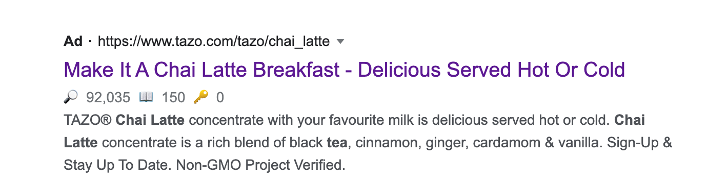
In the example above, I searched for a chai tea latte mix (for those days when I want to make a fancy caffeinated drink at home). I’ve heard of Tazo’s product before, so I clicked the ad. Here’s where I landed: a generic product page.

Source: Tazo
Not what I expected. I didn’t have the patience to navigate it, so I bounced. But if there was a specific landing page for that product—with one, clear CTA—they could’ve scored another customer.
- Test different variables: You may have heard of A/B testing or split testing before. Essentially, it means to test multiple versions of something to see which one performs better. When it comes to your call to action, what should you test? Copy, colors, fonts, sizes, placements, and surrounding click triggers are elements you could test and refine to maximize conversions.

Source: Send Grid
Are you using a blue button? See how it compares to an orange one. Should the copy be “Start Your Trial” or Start My Trial”? You may not think these changes would make an impact, but you won’t know until you test them. (And odds are—you’ll spot some differences in the results!)
Get Started with Galactic Fed Today!
Speaking of calls to action, our Galactic Fed experts are here to lend a hand and help you craft up high-converting CTAs so you can reach your conversion goal. Sometimes, these seemingly simple marketing tasks are the hardest to execute.
Or, if you want more of this content sent straight to your email, sign up for our weekly newsletter. You can find the CTA button below! See what we did there?